Many plots become more useful when we separate the data into meaningful groups. The relationship between two variables might look simple overall, but the pattern can differ across continents, years, regions, parties, income groups, or other subgroups.
There are two common ggplot2 strategies:
Map a grouping variable to an aesthetic such as color, shape, fill, or linetype.
Use facets to create small multiples: repeated panels that show the same plot for different subsets of the data.
Both approaches are useful. The question is not which one is always better. The question is which one makes the comparison easier.
5.2 Start with one plot
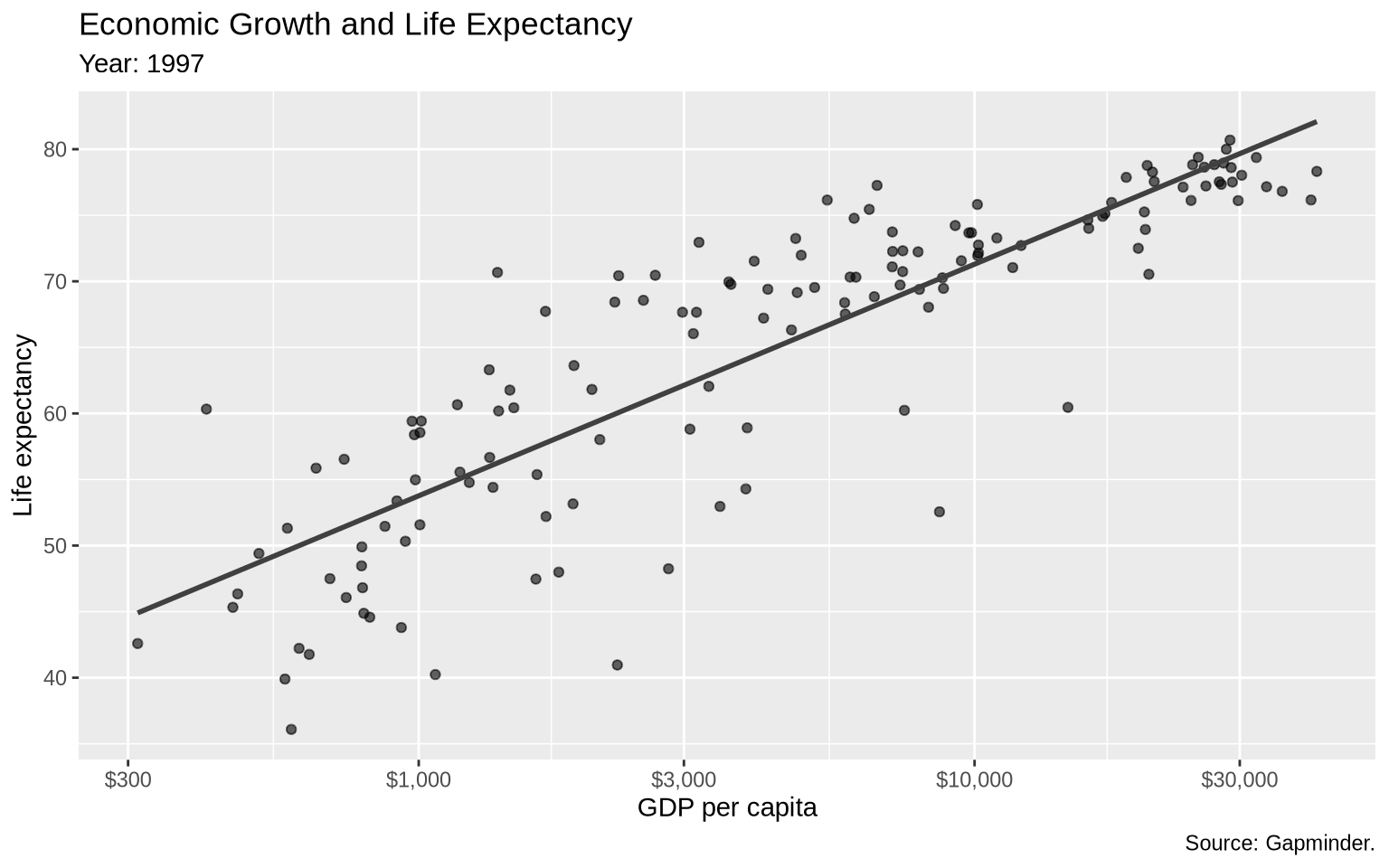
We will use Gapminder data to compare GDP per capita and life expectancy. First, filter to one year so that each point is one country.
gap_1997 <- gapminder |>filter(year ==1997)base_gap <-ggplot(data = gap_1997,mapping =aes(x = gdpPercap, y = lifeExp)) +geom_point(alpha =0.6) +geom_smooth(method ="lm", formula = y ~ x, se =FALSE, color ="gray25") +scale_x_log10(labels =dollar_format(accuracy =1)) +scale_y_continuous(breaks =seq(20, 90, by =10)) +labs(title ="Economic Growth and Life Expectancy",subtitle ="Year: 1997",x ="GDP per capita",y ="Life expectancy",caption ="Source: Gapminder." )base_gap
The log scale on the x-axis helps because GDP per capita is very skewed. Without it, the lower-income countries would be compressed into a small part of the plot.
5.3 Color as separation
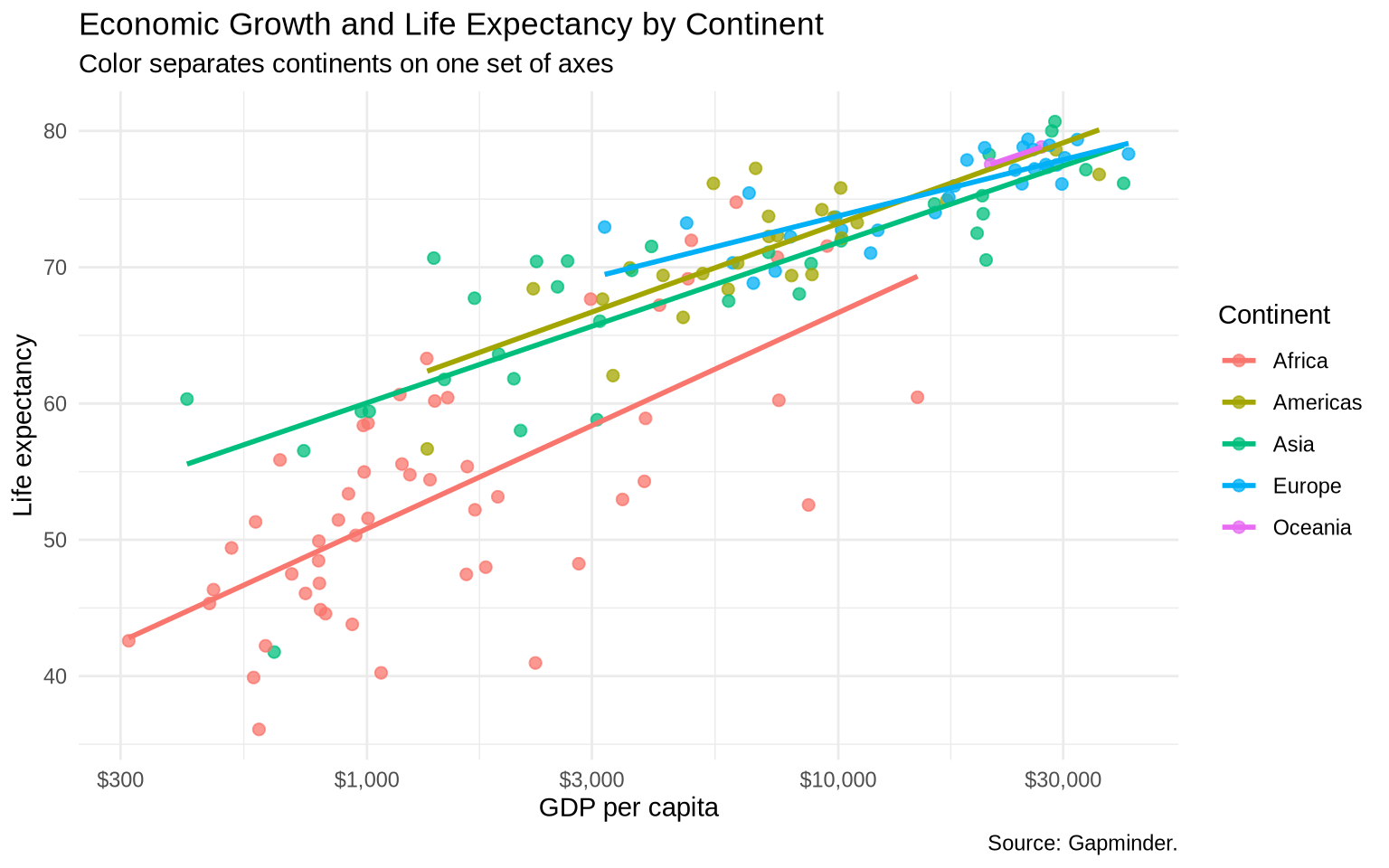
One way to separate groups is to map a variable to color inside aes().
gap_color <-ggplot(data = gap_1997,mapping =aes(x = gdpPercap, y = lifeExp, color = continent)) +geom_point(alpha =0.75, size =2) +geom_smooth(method ="lm", formula = y ~ x, se =FALSE) +scale_x_log10(labels =dollar_format(accuracy =1)) +labs(title ="Economic Growth and Life Expectancy by Continent",subtitle ="Color separates continents on one set of axes",x ="GDP per capita",y ="Life expectancy",color ="Continent",caption ="Source: Gapminder." ) +theme_minimal()gap_color
Because continent is mapped inside aes(), ggplot2 treats color as part of the data mapping and creates a legend. If we wrote geom_point(color = "steelblue"), every point would be steel blue and no legend would be needed.
5.4 Facets as small multiples
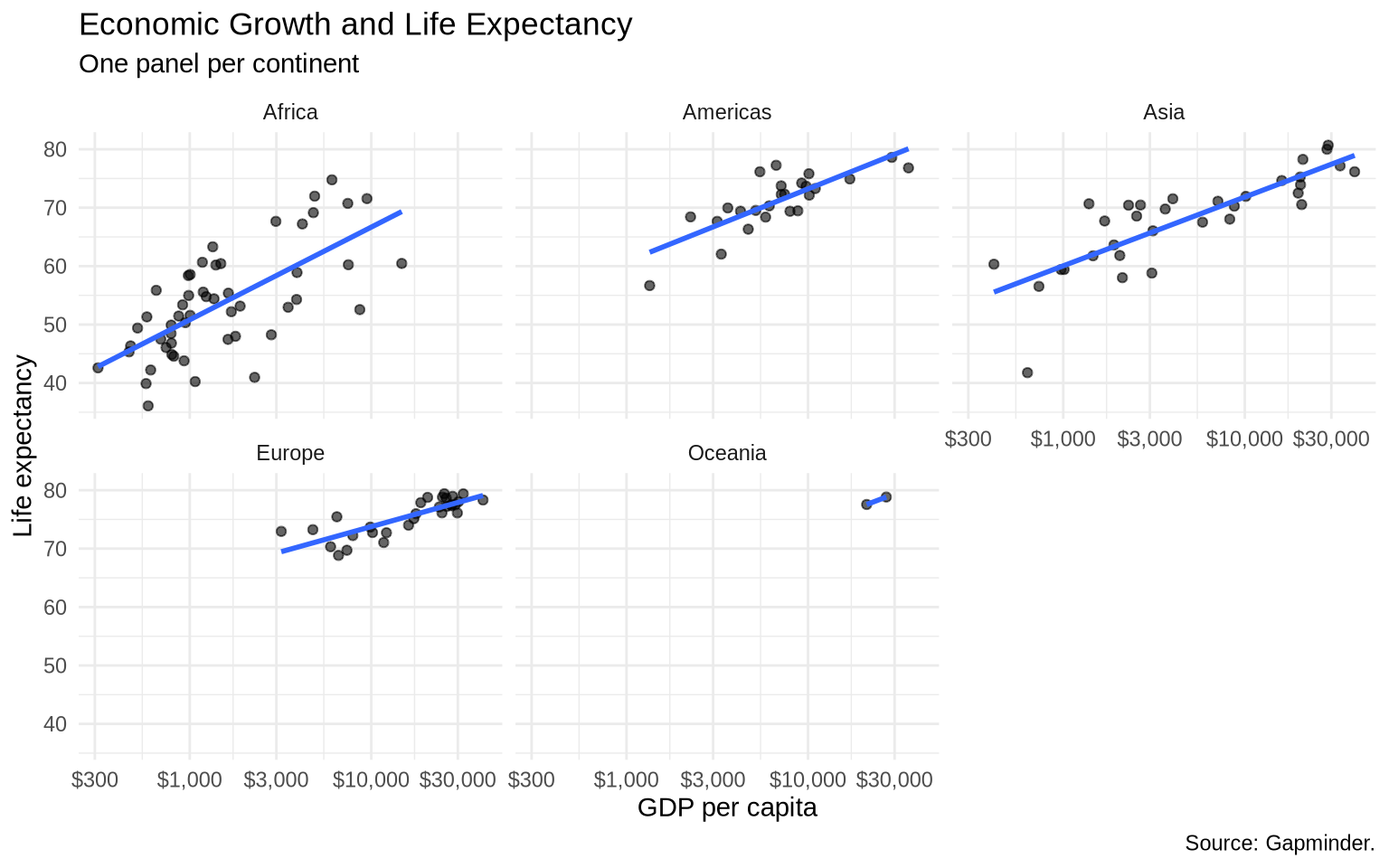
Faceting creates one panel for each level of a variable. This gives each group its own space.
ggplot(data = gap_1997, mapping =aes(x = gdpPercap, y = lifeExp)) +geom_point(alpha =0.6) +geom_smooth(method ="lm", formula = y ~ x, se =FALSE) +scale_x_log10(labels =dollar_format(accuracy =1)) +facet_wrap(~ continent) +labs(title ="Economic Growth and Life Expectancy",subtitle ="One panel per continent",x ="GDP per capita",y ="Life expectancy",caption ="Source: Gapminder." ) +theme_minimal()
The default shared scales make comparisons across panels fair. Africa and Europe are plotted on the same x and y ranges, so differences in location and spread are visible.
5.5 Controlling Facet Layout
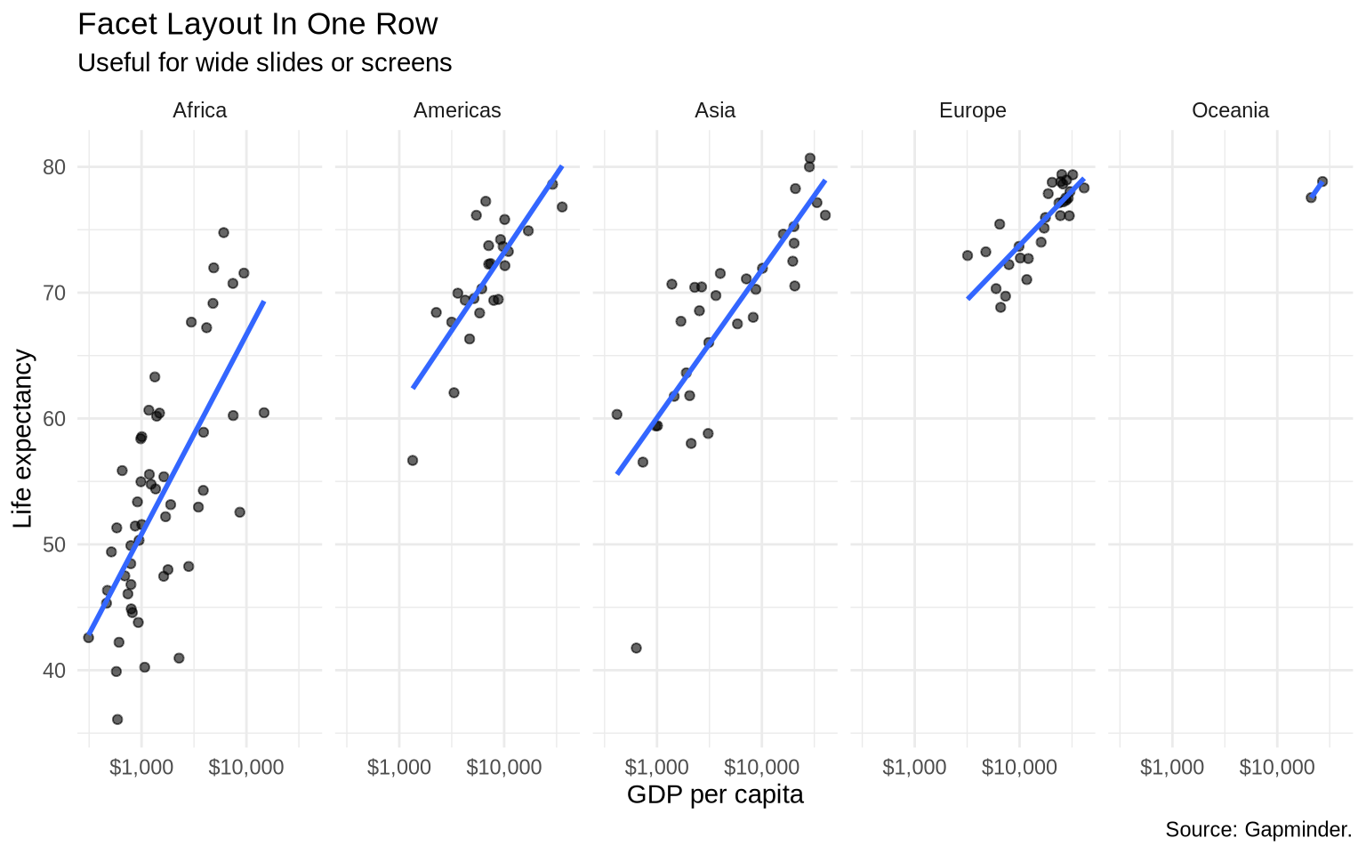
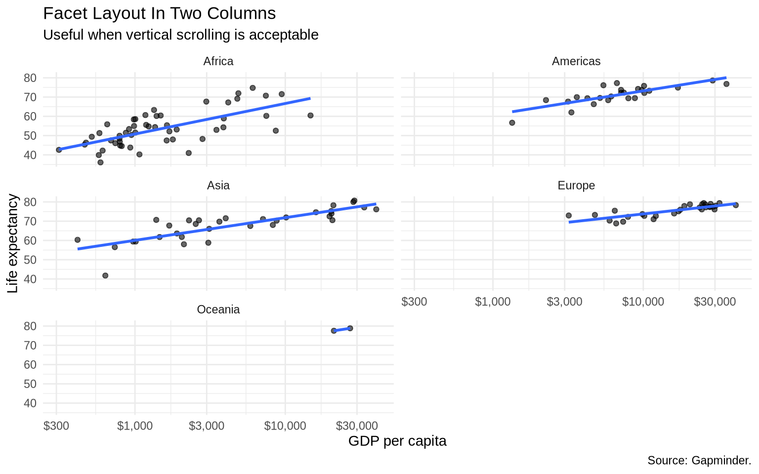
facet_wrap() chooses the panel layout automatically. The arguments nrow and ncol give direct control over the number of rows or columns. The data do not change; only the arrangement of panels changes.
ggplot(data = gap_1997, mapping =aes(x = gdpPercap, y = lifeExp)) +geom_point(alpha =0.6) +geom_smooth(method ="lm", formula = y ~ x, se =FALSE) +scale_x_log10(breaks =c(1000, 10000),labels =dollar_format(accuracy =1) ) +facet_wrap(~ continent, nrow =1) +labs(title ="Facet Layout In One Row",subtitle ="Useful for wide slides or screens",x ="GDP per capita",y ="Life expectancy",caption ="Source: Gapminder." ) +theme_minimal()
The one-row layout leaves each panel narrow. Without fewer x-axis breaks, the dollar labels overlap. The breaks = c(1000, 10000) argument tells ggplot2 to label only those two x-axis values, while the log scale and the data remain unchanged.
ggplot(data = gap_1997, mapping =aes(x = gdpPercap, y = lifeExp)) +geom_point(alpha =0.6) +geom_smooth(method ="lm", formula = y ~ x, se =FALSE) +scale_x_log10(labels =dollar_format(accuracy =1)) +facet_wrap(~ continent, ncol =2) +labs(title ="Facet Layout In Two Columns",subtitle ="Useful when vertical scrolling is acceptable",x ="GDP per capita",y ="Life expectancy",caption ="Source: Gapminder." ) +theme_minimal()
Use nrow or ncol when the default layout makes labels cramped or when the output format matters. A layout that works well in a wide slide may not work well in a narrow book column.
5.6 Reordering facets
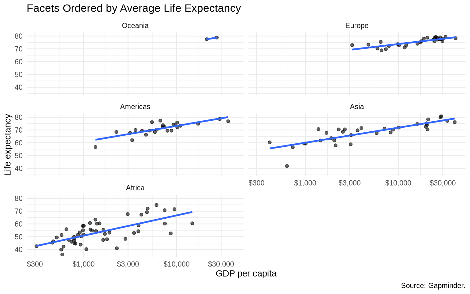
Facet order is not always meaningful by default. We can reorder the continent variable by average life expectancy.
gap_1997_ordered <- gap_1997 |>mutate(continent =fct_reorder(.f = continent,.x = lifeExp,.fun = mean,.desc =TRUE ) )ggplot(data = gap_1997_ordered, mapping =aes(x = gdpPercap, y = lifeExp)) +geom_point(alpha =0.6) +geom_smooth(method ="lm", formula = y ~ x, se =FALSE) +scale_x_log10(labels =dollar_format(accuracy =1)) +facet_wrap(~ continent, ncol =2) +labs(title ="Facets Ordered by Average Life Expectancy",x ="GDP per capita",y ="Life expectancy",caption ="Source: Gapminder." ) +theme_minimal()
fct_reorder() changes the order of the factor levels. That order is then used by facet_wrap().
5.7 Free scales
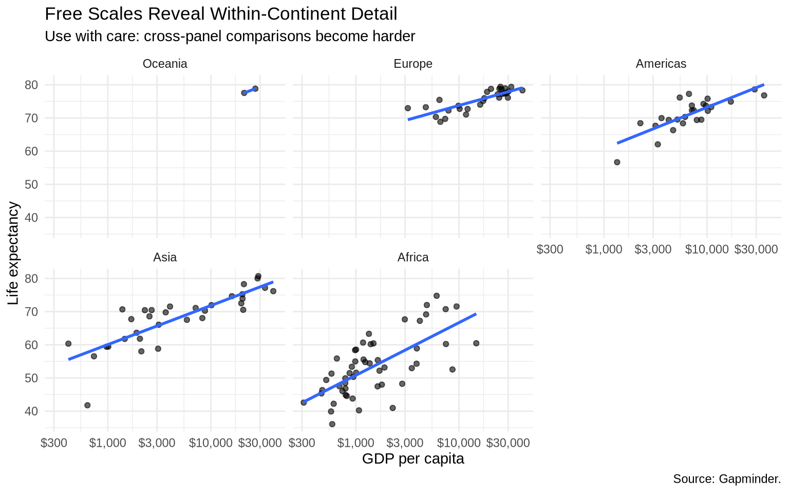
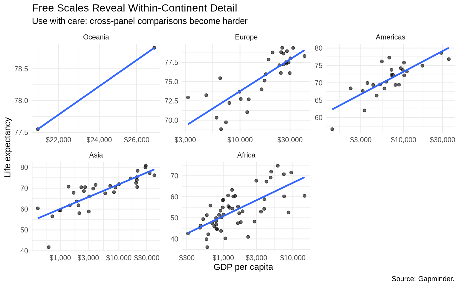
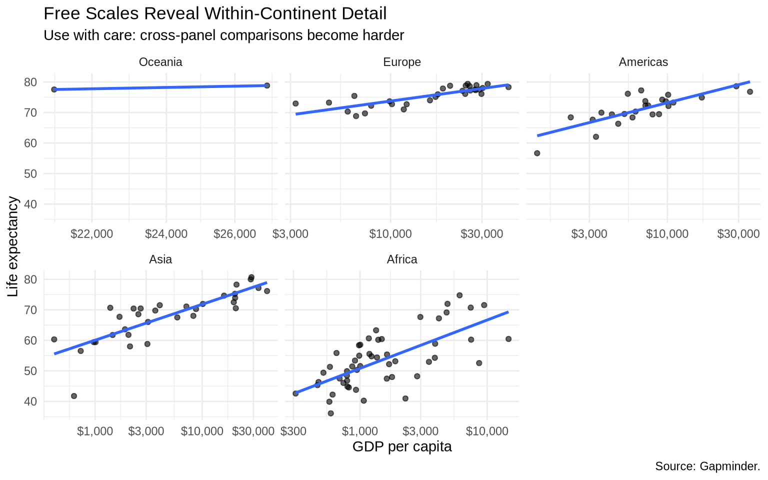
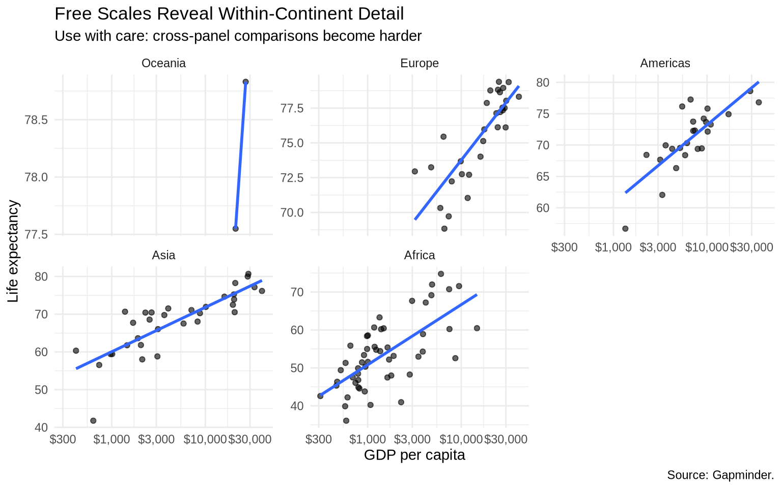
Sometimes fixed scales make within-group patterns hard to see. Free scales let each panel use its own axis range.
free97 <-ggplot(data = gap_1997_ordered, mapping =aes(x = gdpPercap, y = lifeExp)) +geom_point(alpha =0.6) +geom_smooth(method ="lm", formula = y ~ x, se =FALSE) +scale_x_log10(labels =dollar_format(accuracy =1)) +labs(title ="Free Scales Reveal Within-Continent Detail",subtitle ="Use with care: cross-panel comparisons become harder",x ="GDP per capita",y ="Life expectancy",caption ="Source: Gapminder." ) +theme_minimal()# fixed scalesfree97 +facet_wrap(~ continent)
# free x and y scalesfree97 +facet_wrap(~ continent, scales ="free")
# free x scalefree97 +facet_wrap(~ continent, scales ="free_x")
# free y scalefree97 +facet_wrap(~ continent, scales ="free_y")
Fixed scales emphasize comparison across groups. Free scales emphasize detail within each group.
5.8 Choosing Between Aesthetics And Faceting
There is no fixed rule here. Both approaches work, and the right choice usually reveals itself when you try one and find it unsatisfying.
A plot that maps groups to color keeps everything on shared axes, which can make comparisons direct and immediate. That works well when the groups are few enough that the colors stay distinct and the plot doesn’t feel cluttered. When it starts to feel crowded — labels overlapping, colors hard to tell apart, too much happening in one panel — that is usually a sign to try faceting instead. Facets give each group its own space, and the consistent scales still allow comparison across panels.
You can also combine both: facet by one variable to create the panels, and use color within each panel to show a second grouping. That is what the state examples in this chapter do — facets separate years, region colors the text labels within each year.
The practical test is simply whether the plot is easy to read. If the comparison you want to make is hard to see, try the other approach.
5.9 Direct labels
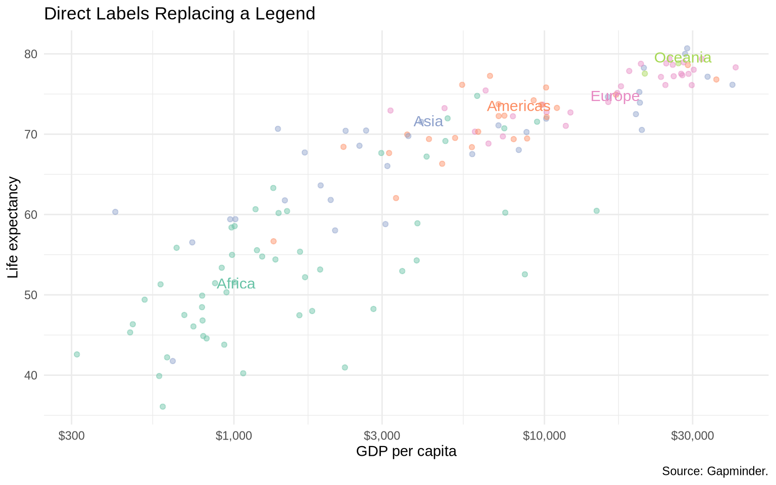
Legends require the reader to look back and forth between the data and the key. Direct labels can reduce that work.
The next plot uses scale_color_brewer() to apply a named RColorBrewer palette. The palette changes only the colors used for continents; it does not change the data, mapping, or labels. Set2 is a qualitative palette, which means it is designed for unordered categories.
Direct labels work best when there are not too many groups and there is enough space for the labels. They are most useful when group identification matters and the legend forces too much back-and-forth reading.
5.10facet_grid()
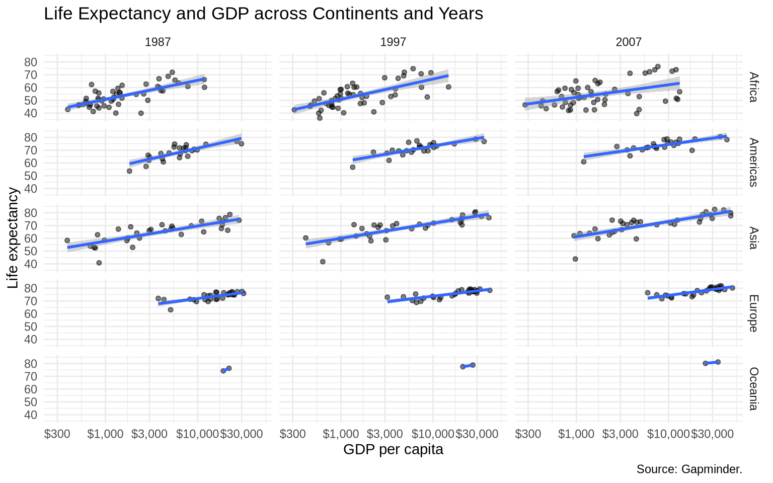
facet_wrap() is usually the easiest choice for one grouping variable. facet_grid() is useful when the panel layout has rows and columns with substantive meaning.
gap_recent <- gapminder |>filter(year %in%c(1987, 1997, 2007))ggplot(data = gap_recent, mapping =aes(x = gdpPercap, y = lifeExp)) +geom_point(alpha =0.5, size =1.3) +geom_smooth(method ="lm") +scale_x_log10(labels =dollar_format(accuracy =1)) +facet_grid(continent ~ year) +labs(title ="Life Expectancy and GDP across Continents and Years",x ="GDP per capita",y ="Life expectancy",caption ="Source: Gapminder." ) +theme_minimal()
Read facet_grid(continent ~ year) as “continent defines the rows, year defines the columns.”
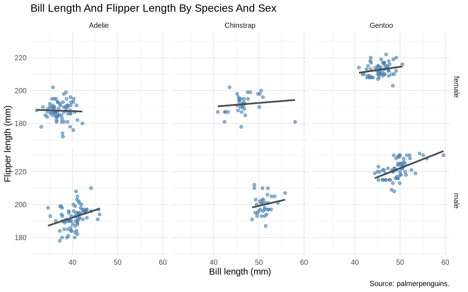
facet_grid() is most compelling when both variables are genuinely categorical and unordered — not one categorical and one time dimension. Penguin data has two such variables: species (three unordered categories) and sex (two). A 3×2 grid of scatterplots lets the reader scan both dimensions at once.
penguins <-read_csv("Data/penguins/penguins.csv", show_col_types =FALSE) |>filter(!is.na(sex))ggplot(penguins, aes(x = bill_length_mm, y = flipper_length_mm)) +geom_point(alpha =0.6, color ="steelblue") +geom_smooth(method ="lm", formula = y ~ x, se =FALSE, color ="gray30") +facet_grid(sex ~ species) +labs(title ="Bill Length And Flipper Length By Species And Sex",x ="Bill length (mm)",y ="Flipper length (mm)",caption ="Source: palmerpenguins." ) +theme_minimal()
Each row is one sex, each column is one species. Scanning across a row shows species differences for a given sex. Scanning down a column shows sex differences within a species. Neither comparison requires the reader to look between panels that aren’t aligned.
5.11 Patchwork
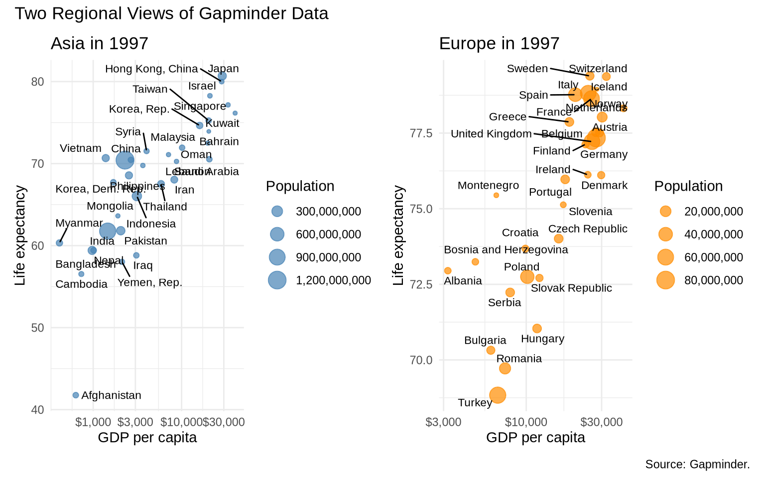
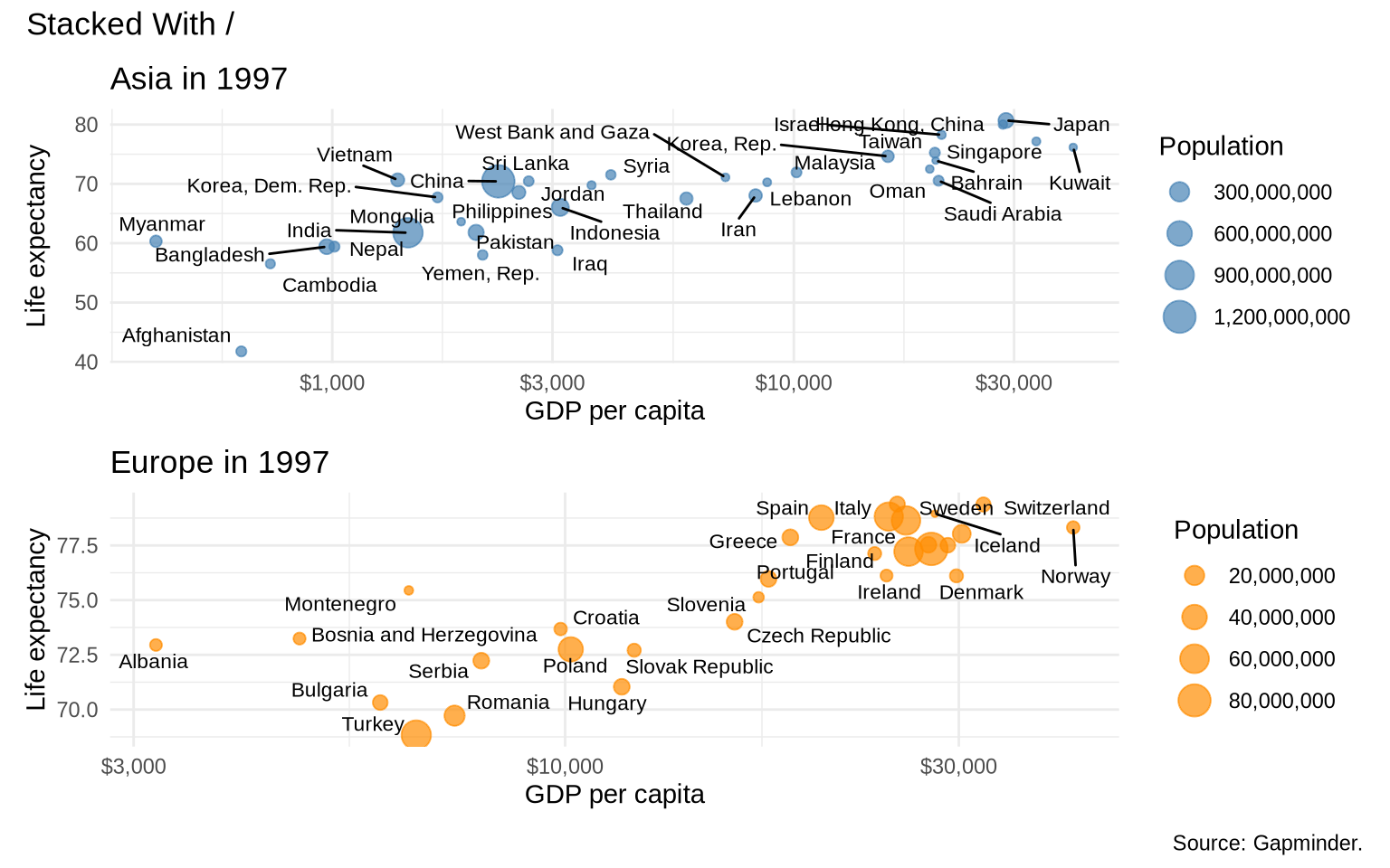
Facets repeat the same plot structure across groups. Sometimes you want to combine different plots into one figure. The patchwork package lets you assemble separate ggplot objects.
The next plots map population to point size with aes(size = pop). As in the continuous-size example from Chapter 04, scale_size_continuous() adjusts the size scale and formats the size legend.
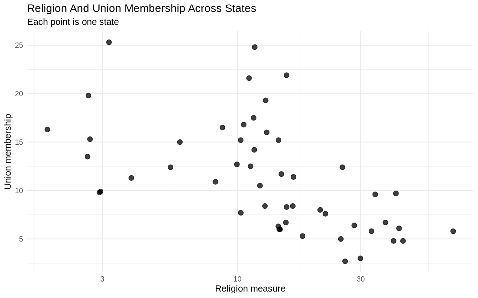
The two variables in the next plot are percentages.
ggplot( state_policy,aes(x = religion_pct, y = union_pct)) +geom_point(size =2.5, alpha =0.75) +scale_x_log10() +labs(title ="Religion And Union Membership Across States",subtitle ="Each point is one state",x ="Religion measure",y ="Union membership" ) +theme_minimal()
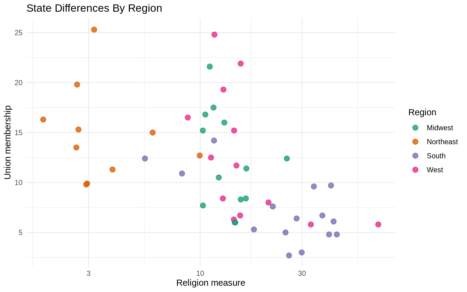
Color can separate regions without creating multiple panels. This is useful when the plot is still readable with all observations in one place.
ggplot( state_policy,aes(x = religion_pct, y = union_pct, color = region)) +geom_point(size =2.8, alpha =0.8) +scale_x_log10() +scale_color_brewer(palette ="Dark2") +labs(title ="State Differences By Region",x ="Religion measure",y ="Union membership",color ="Region" ) +theme_minimal()
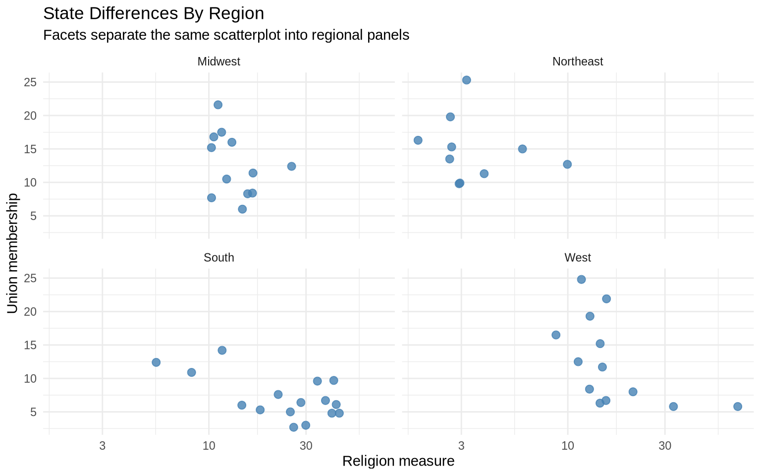
Facets split the same data into small multiples. This makes regional comparisons clearer when the color version starts to feel crowded.
ggplot( state_policy,aes(x = religion_pct, y = union_pct)) +geom_point(color ="steelblue", size =2.5, alpha =0.8) +scale_x_log10() +facet_wrap(~ region) +labs(title ="State Differences By Region",subtitle ="Facets separate the same scatterplot into regional panels",x ="Religion measure",y ="Union membership" ) +theme_minimal()
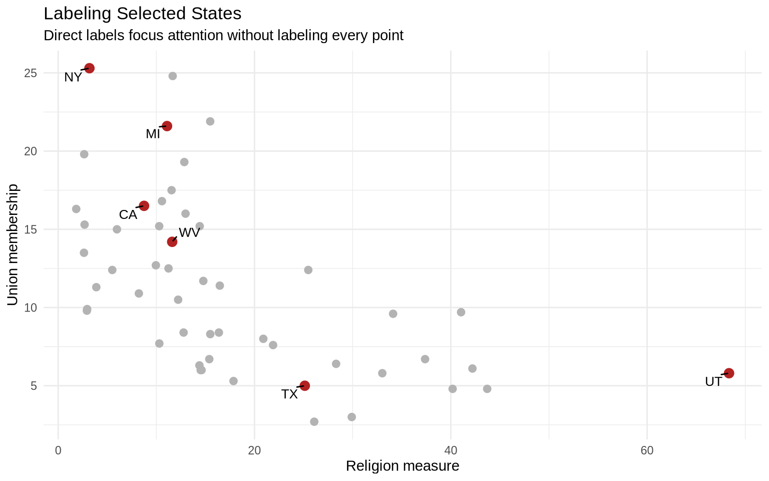
Direct labels are useful when a few cases matter. Labeling every state would crowd the figure, so the next example labels only selected states.
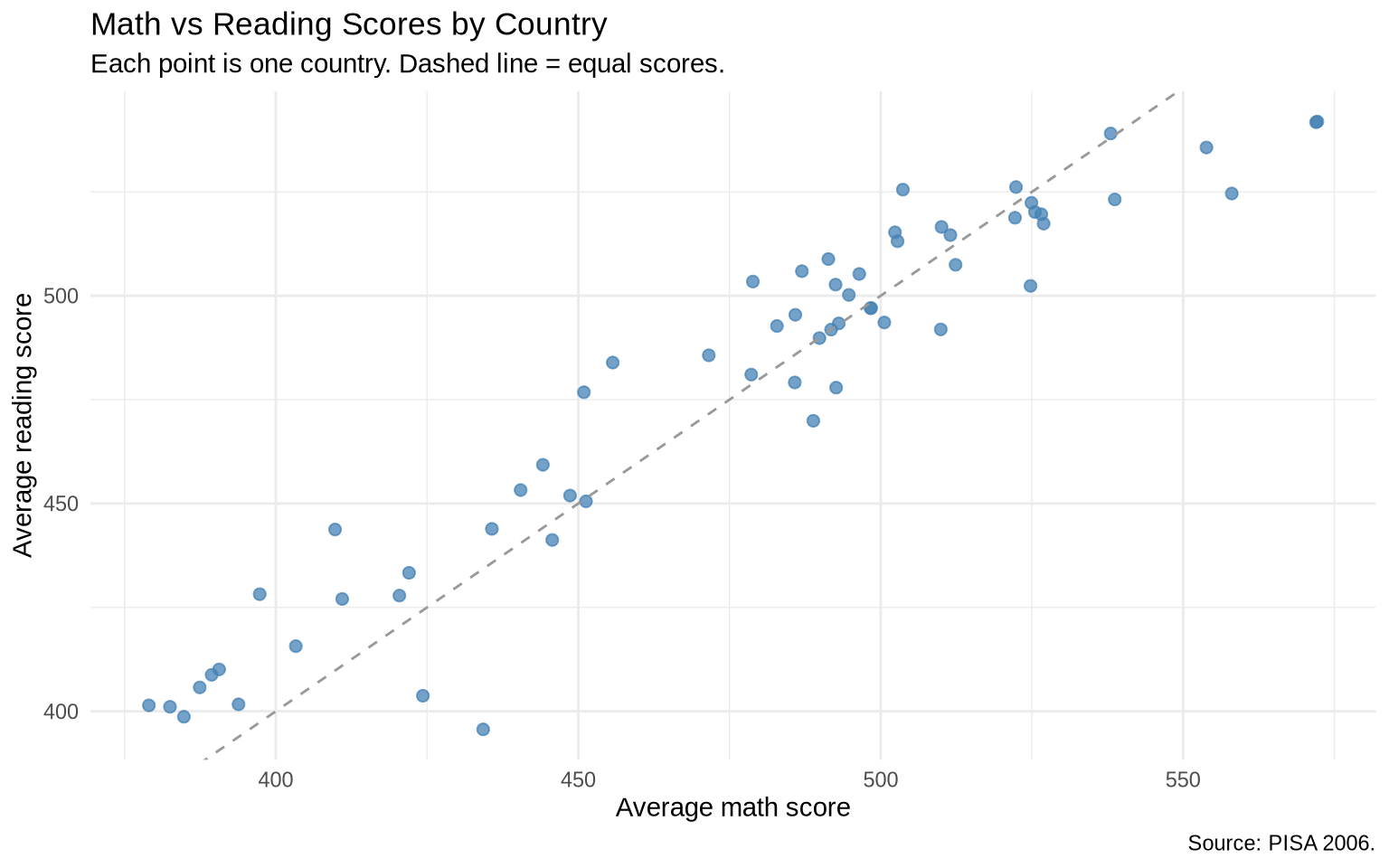
The PISA dataset contains results from the 2006 OECD Programme for International Student Assessment. Each of the roughly 152,000 rows is one student. Variables include country and average scores in math, reading, and science.
A scatterplot of math against reading scores shows how the two subjects correlate across countries. The dashed line marks equal scores in the two subjects.
ggplot(pisa_country, aes(x = math, y = reading)) +geom_point(color ="steelblue", alpha =0.75, size =2) +geom_abline(linetype ="dashed", color ="gray60") +labs(title ="Math vs Reading Scores by Country",subtitle ="Each point is one country. Dashed line = equal scores.",x ="Average math score",y ="Average reading score",caption ="Source: PISA 2006." ) +theme_minimal()
Most countries fall close to the dashed line, which means national math and reading averages tend to move together. Countries farther from the line are cases where one subject is notably stronger than the other.
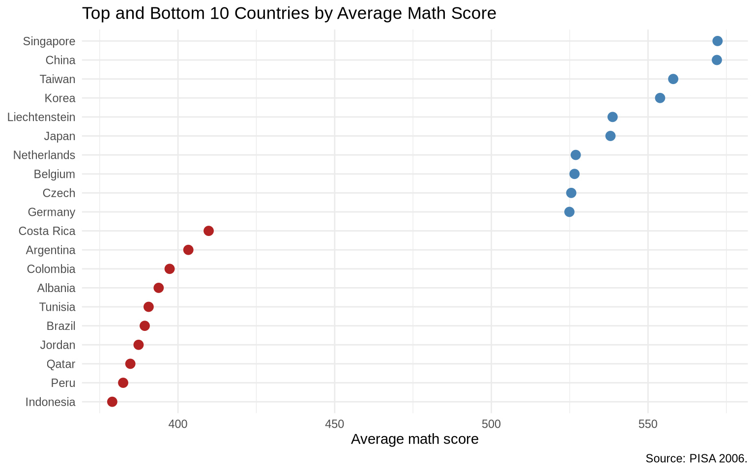
We can also rank countries by math score and look at the top and bottom performers.
Here scale_color_manual() assigns exact colors to the two summary groups. Manual scales are useful when colors should carry consistent meaning across plots, such as top versus bottom groups or before versus after periods.
pisa_overall <- pisa |>group_by(country_code) |>summarize(math =mean(average_math_score, na.rm =TRUE),reading =mean(average_reading_score, na.rm =TRUE) )top_bottom <- pisa_overall |>slice_max(math, n =10) |>bind_rows(pisa_overall |>slice_min(math, n =10)) |>mutate(group =if_else(math >=median(pisa_overall$math), "Top 10", "Bottom 10"))ggplot(top_bottom, aes(x = math, y =reorder(country_code, math))) +geom_point(aes(color = group), size =3, show.legend =FALSE) +scale_color_manual(values =c("Top 10"="steelblue", "Bottom 10"="firebrick")) +labs(title ="Top and Bottom 10 Countries by Average Math Score",x ="Average math score",y =NULL,caption ="Source: PISA 2006." ) +theme_minimal()
5.14 Extra: State Ideology And Partisanship
In chapter 4, geom_text_repel() labeled states in a single year. The separation techniques in this chapter give those labels more room and more meaning — faceting by year makes it possible to compare two cross-sections of the same states without the labels colliding.
The Correlates of State Policy data has two measures that capture different aspects of state politics:
pid: net partisanship — Democratic minus Republican party identification
pollib_median: policy liberalism — a composite index of policy outputs; higher values indicate more liberal policy on issues like minimum wage, abortion, gun control, and similar measures
Loading the data:
states <-read_csv("Data/state_policy/cspp_states.csv", show_col_types =FALSE)states_compare <- states |>filter(year %in%c(1976, 2011))
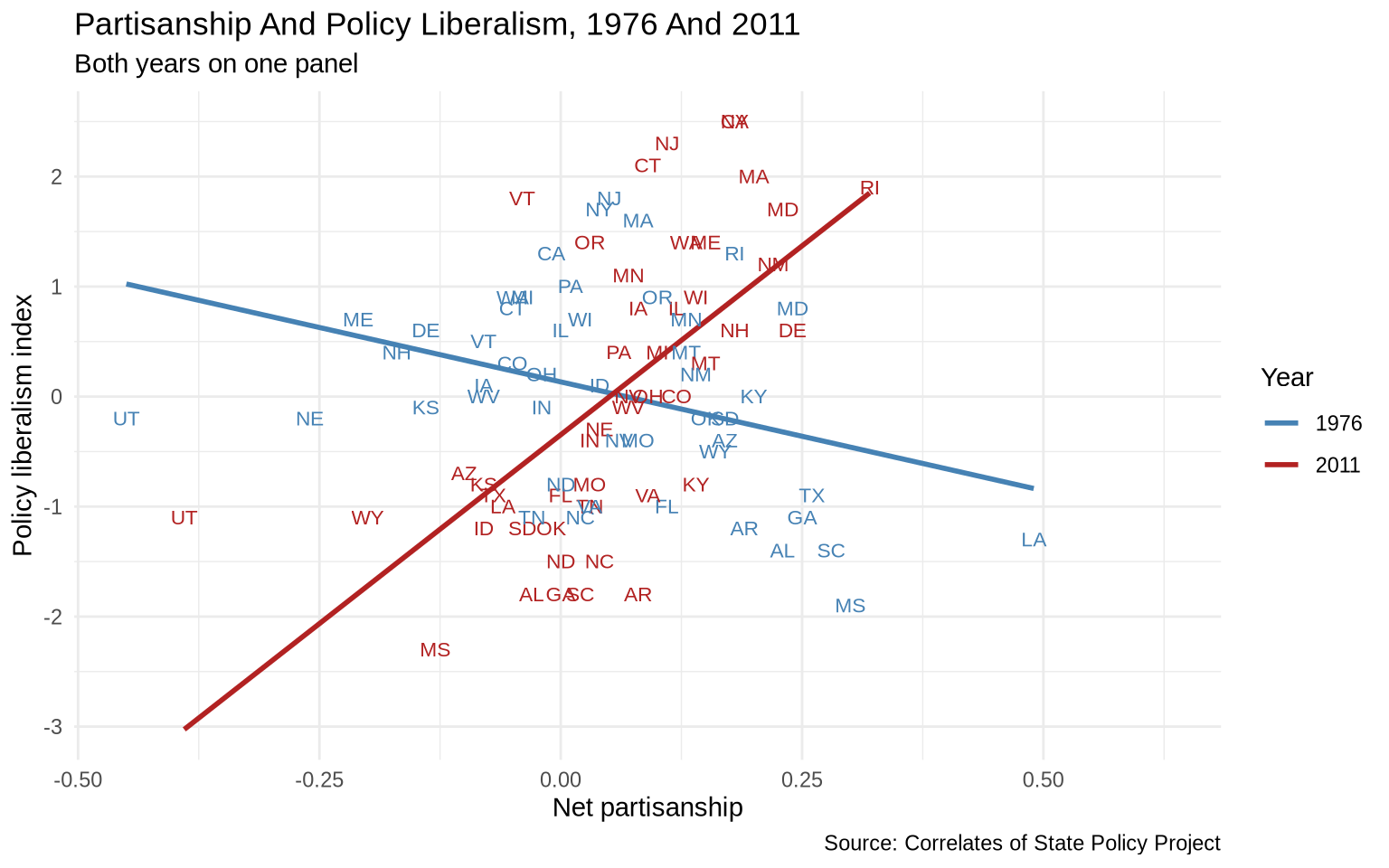
On a single panel with both years colored, we can see the overall shape of the relationship but individual states are hard to read.
The next plot also uses a manual color scale so the two years have stable, named colors.
ggplot(states_compare, aes(x = pid, y = pollib_median, color =as.factor(year))) +geom_smooth(method ="lm", formula = y ~ x, se =FALSE) +geom_text(aes(label = st), size =3, show.legend =FALSE) +scale_color_manual(values =c("1976"="steelblue", "2011"="firebrick")) +labs(title ="Partisanship And Policy Liberalism, 1976 And 2011",subtitle ="Both years on one panel",x ="Net partisanship",y ="Policy liberalism index",color ="Year",caption ="Source: Correlates of State Policy Project" ) +theme_minimal()
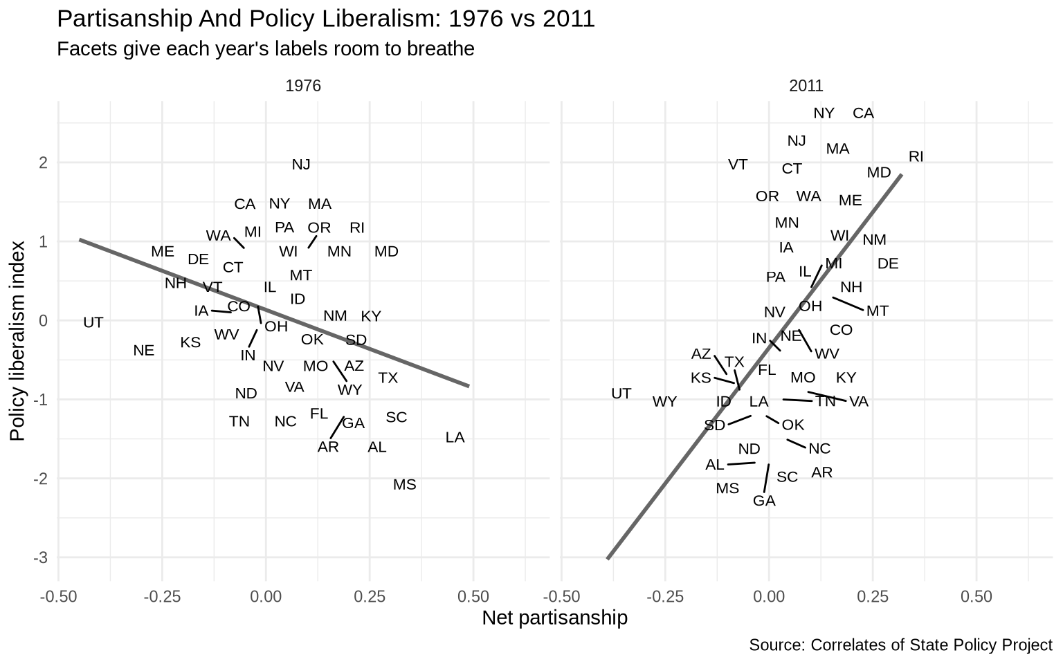
The two regression lines suggest the relationship has shifted, but with both years overlaid the state labels are crowded and hard to read. Faceting by year gives each panel room.
ggplot(states_compare, aes(x = pid, y = pollib_median)) +geom_smooth(method ="lm", formula = y ~ x, se =FALSE, color ="gray40") +geom_text_repel(aes(label = st), size =3) +facet_wrap(~ year) +labs(title ="Partisanship And Policy Liberalism: 1976 vs 2011",subtitle ="Facets give each year's labels room to breathe",x ="Net partisanship",y ="Policy liberalism index",caption ="Source: Correlates of State Policy Project" ) +theme_minimal()
The faceted version makes the comparison readable. The slope in 2011 is steeper: Democratic-leaning states had adopted more liberal policies relative to Republican-leaning states than was the case in 1976. The labels make it possible to identify which specific states drive that pattern.
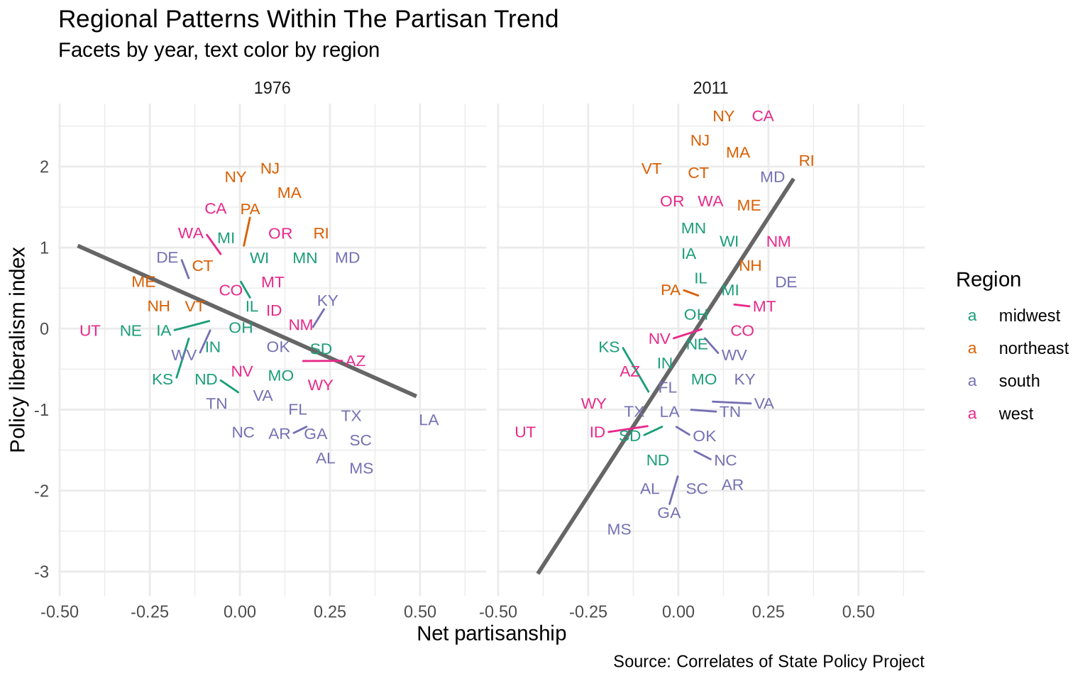
Coloring the text by region adds another layer of separation without adding more panels. It shows whether states that sit above or below the trend line in a given year share a regional pattern.
ggplot(states_compare, aes(x = pid, y = pollib_median)) +geom_smooth(method ="lm", formula = y ~ x, se =FALSE, color ="gray40") +geom_text_repel(aes(label = st, color = region.name), size =3) +scale_color_brewer(palette ="Dark2") +facet_wrap(~ year) +labs(title ="Regional Patterns Within The Partisan Trend",subtitle ="Facets by year, text color by region",x ="Net partisanship",y ="Policy liberalism index",color ="Region",caption ="Source: Correlates of State Policy Project" ) +theme_minimal()
Southern states cluster on the right in 1976 but the regional clustering shifts by 2011 as partisan sorting hardened. This is a case where combining facets (separation across years) with color (separation across regions) reveals structure that neither technique could show on its own.
5.15 Exercise
Use gapminder to make a comparison plot for 2007.
Filter the data to year == 2007.
Make a scatterplot of GDP per capita and life expectancy.
Separate continents using color.
Make a second version using facet_wrap(~ continent).
Decide which version makes the comparison clearer and write one sentence explaining why.